
Postmortems are traditionally reserved for critiquing the development processes of entire games, but it shouldn't be too far of a stretch to apply the same kind of analysis to a single level.
Introduction
This level was made for a homework assignment for the class that this blog was originally created for. The project was really open; all we had to do was create "something" that would highlight what we've been learning in class. Some people made videos, others made skits, and one group went as far as to make a advertisement campaign with the goal of getting more students to sign up for the class next semester.
Naturally, I decided to make a level, and the game I chose to make it in was Canvas Rider, an HTML5 remake of the popular Flash game Free Rider 2. The level is currently uploaded to the Interguild. To play it, copy the code in the textbox, visit the game page, paste the code into the textbox under the game, and click load.
What Went Right
1. Choosing to Make a Tutorial Level
For my presentation, I decided that I wasn't going to play through the level on my own. Instead, I would pick a volunteer from the class to play the level while I talked about it. Not only did this make for a more interesting presentation, but it also allowed me to challenge my game design skills when making this level. I assumed that no one in the class was familiar with the game, so the tutorial level had to be designed well enough to deliver an interesting experience while teaching the player how to play.

2. Using Real Level Design
I've been making terrible levels for years, but considering everything I've learned about game design since last summer, it's about time I finally applied those skills concretely. Because I saw this as a way to challenge myself, I put much more care into designing this level than I would have otherwise.
For instance, this was the first time that I was worried about the pacing of a level. It led me to add simple and easy sections in places where I simply would have neglected in the past. Once I started thinking about my level's potential interest curve, it really became clear how badly paced many of my previous levels were.
3. Deciding to Cut the Second Half
If you've played the level, you'll know that the Z button isn't introduced until the very end. I originally wanted to create a series of scenarios following this point that would repeatedly use this concept to make sure the player got used to the idea of flipping the bike (a concept that took me a while to get used to).
But in order to keep the level's interest curve shaped properly, the rather simple scenarios I had already drawn up demanded that the level be extended considerably in order to build up to something more interesting. I simply didn't have the time to work on this level any longer, so I reluctantly decided to throw away this large chunk of work and end the level earlier. By placing the ending at this point of the level, rather than directly after my discarded section, the level as a whole felt much more solid.
 |
| The discarded section. Hey, is that GLaDOS? |
Fortunately, I was very satisfied with the new ending that replaced this section. As I've stated in the discussion of my level on the Interguild, the open, half-pipe-like environment at the end was a much more engaging way to teach the player how to use the Z button. This section basically gave the player a little "play area", where they could experiment with the controls and try different techniques, and it even gave them an interesting goal to try to achieve while they were there. It's always nice when reaching the end of a level doesn't mean you have to stop playing.
 |
| The new ending. |
4. Perfect Timing on the Interguild
At the Interguild, we're currently experiencing a drought of some sorts. Not many notable levels get uploaded very often, and with more and more of our members starting to attend college, it's hard for many of us to find the time to be online. Although, I think another reason for the lack of levels is that we've pretty much run out of ideas, which is evident when one looks at our recent competitions.
So lately, I've been proposing that we as a community start making levels that explore the fascinating field of level design. This homework assignment has given me the perfect excuse to take the time out of my busy schedule and make such a level. The timing was great, and I'm hoping that my level and my discussions about it will inspire other Interguild members to start thinking more deeply about how to make a good level.
5. Some Playtesting
Game developers know that playtesting is absolutely necessary to create an amazing game. When making levels in the past, I had never gone out of my way to get people to play my level before it was done. With this level, I made sure to finish early so that I could get people playing it and giving me feedback on what could be changed.
This primarily helped me realize just how annoying certain sections of the level were, such as the "Blogosphere", which killed most players simply for going a little too fast.
 |
| Before. |
 |
| After. |
What Went Wrong
1. Not enough Playtesting
Unfortunately, none of the playtesting was done in person, so I never got to see how people were actually playing my level. My perception was limited strictly to what these players would tell me, which wasn't much help. This was a sharp contrast to the class presentation, when simply watching my level getting played was an eye-opening experience to my level's major flaws.
For instance, the gravity shift mechanic was introduced terribly. Players were more likely to zoom past the green arrow and the text that explained what it does. Perhaps players were too focused on trying to keep their speed up because they mistakenly thought that they were in a middle of a giant loop-de-loop:
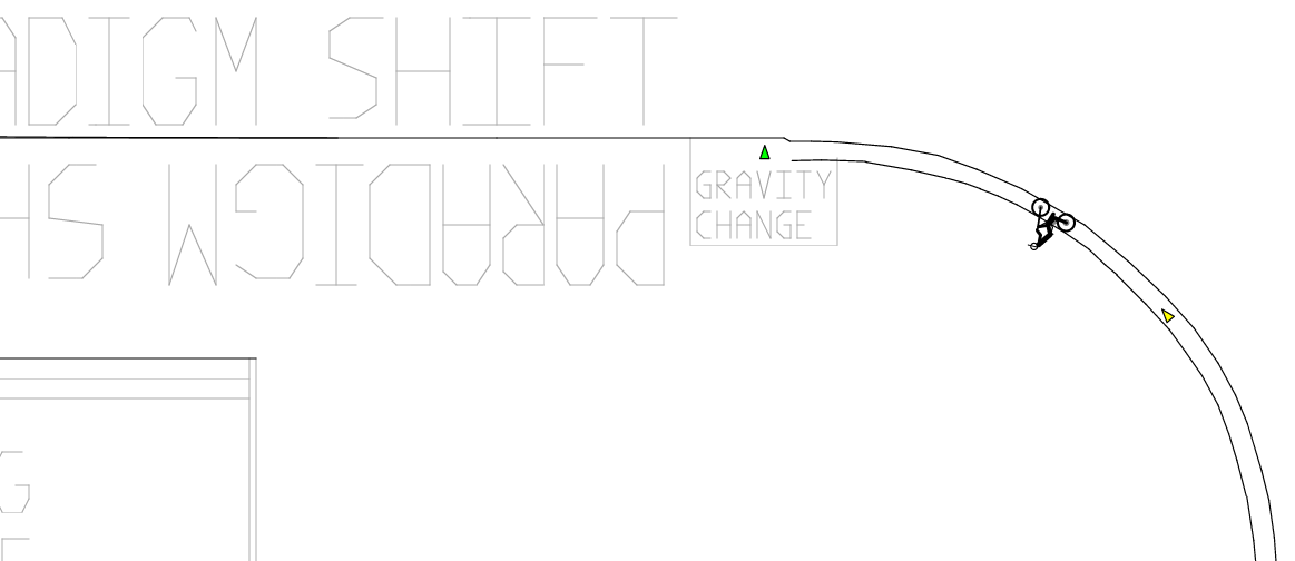
This meant that they would be confused when they stuck onto the bottom of the track and then completely baffled at the next segment, when they jumped off the track and fell up instead of down:

I also realized how easy it was to accidentally skip about half of the level. I knew this flaw existed, but I didn't do much about it because I figured that the player would most likely not survive the fall between the Twitter bird and Google search box.
 |
| Follow the red path, and you're dead. Right? |
2. Tiny Tutorial Text
This is by far the most embarrassing mistake that I had overlooked while making this level. Perhaps I find it embarrassing because my graphic design experience gives me no excuse to overlook the fact that my text is illegible. But how did this happen? Let's look at the beginning of the level again:
It was while drawing this screen when I established the style in which I would write the tutorial messages. For the sake of consistency, I continued the same style for the following few messages:

Already, you start to see a problem. With the downward slope, the player inevitably starts to pick up speed, making it all the more likely that they'll overlook these messages. In fact, during the presentation, I had to tell the player that he needed to press Enter to restart the level. Perhaps it would've been a better idea to put that message near common areas of death instead.

The above tutorial message should've been a red flag for me. Even when I played the level, I always went way too fast to even comprehend what this object was as I passed by it. Clearly, the text had to be bigger. Compare its legibility with the big "MIS 496A".
I think my desire to be consistent led me to get lazy. Rather than asking myself, "what is the best way to explain this to the player?", I instead fell back on my already established method for writing tutorial messages.
2. Canvas Rider is a Badly Designed Game
I initially wanted to make my level using the original Free Rider 2, or more specifically, FR2DB's modified version of FR2, which has checkpoints. But when I loaded the site, I got an alert notifying me that they had moved on to a new FR2 remake called Canvas Rider, so I decided to give this new game a try. Unfortunately, this game turned out to be worse than the original.
Making a level for Free Rider 2 was already very tedious as there is no way to undo/redo edits and you can't cut/paste lines to another part of the screen. You'd think that any remake big enough to justify moving to another site would include such a feature. To be fair, Canvas Rider does let you undo the most previous line drawn, but by mapping it to the Z key, I've accidentally triggered this function countless times while trying to get my bike to turn around (the game thinks you want to undo until you press the Up key, and whatever you do, don't move the mouse!). Because the game features no Redo counterpart to this function, it feels more like the game is tricking me so that it can vandalize my level.
 |
| What does that even mean?? |
 |
| Why do you hate me, Canvas Rider? |
Speaking of power-ups, the design for the new power-ups look extremely lazy. The intuitive drawings from the old game have had all of their character stripped from them and replaced with generic geometric shapes. Look at the two sets of power-ups below and tell me which game looks like more fun:
| Free Rider 2's power-ups (with checkpoint hack) |
| Canvas Rider's power-ups |
 |
| Free Rider 2 |
 |
| Canvas Rider |
I'm sure many of the issues that I pointed out were caused by the technical challenges and limitations of HTML5, but what's so great about HTML5 anyway? What possible benefits could that platform bring to the game that Flash couldn't? By investing the time and resources to make this game fully browser based and Flash free, they've only increased the risk that the game won't run the same in every browser. They've also effectively shrunk the size of their potential audience because a significant percentage of users still do not use an up-to-date browser capable of displaying HTML5.
Perhaps this game is a clear example of someone letting the hype of new technology get to their head.

3. Bad Planning
Now that my rant against Canvas Rider is done, I can now get back to criticizing myself.
Because making levels in this game can be so tedious, I knew that I had to plan the design of this level beforehand so that I wouldn't waste so much time building it. So I took a blank sheet of paper and started drawing sketches and writing notes about what to include in the level, the biggest risks and challenges, and the skills that I wanted the player to learn.
Unfortunately, this takes a lot more discipline than expected. My sketches only include the beginning of the level (up until the Blogosphere). There are certain points during this pre-planning phase when I felt the need to test whether or not my sketches would play well, but rather than building a simple prototype in the game, I ended up building the final product instead. It didn't take long for me to abandon the task of pre-planning and instead start building things without thinking.
This inevitably led to me to draw things that I was then forced to erase, such as the discarded section mentioned earlier. For instance, look at the hill drawn below. I originally drew the full hill, but then I decided that I wanted the player to ride on the drawings rather than riding past them. Because I had already taken the time to perfect the slope of the hill, I decided to salvage it and have another section of the track connect with it.

Because I was designing on the fly, my designs were biased towards preserving what I had already taken the time to draw. If I had only been more disciplined, perhaps I wouldn't have had to move and redraw the Facebook logo three separate times.

4. Very Busy Weekend
I believe I started this level on Friday, November 25th and finished it the next day. Those of you from the United States will recognize this as Thanksgiving weekend, when classes are cancelled for Thursday and Friday of that week. Despite having presumably more time to get things done (minus all the travel and the holiday itself), this was a very busy weekend for me in terms of school work.
The stress of that work strictly limited the time that I could put into this level, and it led me to overlook many problems for the sake of finishing the level sooner. Perhaps I wouldn't have drawn those tutorial messages so small if my working conditions weren't so stressful.
5. Forgot to Submit Homework Files on Time
I'm running out of "things that went wrong" probably because I covered everything by using really broad categories. One of the good things about writing a postmortem is that by being forced to have exactly five things in each section, you're encouraged to include issues that you may have overlooked otherwise. For instance, writing this postmortem has helped me realize how big of an impact outside coursework was leaving on my workflow.
The homework submission process was particularly confusing for this assignment. We had to submit our project files electronically by Wednesday, November 28 at 5pm. Unfortunately, November 28 is actually a Monday, so to be safe, I assumed Monday was the intended due date. I planned to submit my assignment a few hours before 5pm, just in case someone posted some important feedback on the Interguild overnight.
 |
| The full assignment syllabus. |
Conclusion
Overall, I learned a lot from making this level and even more from writing this analysis. As an aspiring game designer, it's great to get all of the practice one can get. While it's necessary to make a lot of games, many people tend to overlook the educational value behind designing levels.
With just a week left in the semester, this article serves as a great transition for this blog's upcoming change from being a class blog to a full gaming blog. I hope to post more analytical articles like this in the future.
well this post was nicely written. I enjoyed reading, and I also took the time to compare the level with the Z stuff and without. I'm not sure which one is better - the Z stuff didn't realy have an ending..
ReplyDeleteanyways, I hope the assignment went good(did it?). how comes your semester ends so quickly? I'm roughly half through mine :o
I put in extra images this time to avoid the wall-of-text feeling given off by my last post. Wow, it's already been a month since that post? I've sure been busy lately.
ReplyDeleteThis semester started in mid-August, so it's probably about 4 months long in total. We have two semesters per year, with the Spring semester starting in January and ending in early May. How long are your semesters?
Despite all the self-criticisms you have Livio, I'm honestly impressed by this level. Having a level that teaches mechanics, avoids insulting the player's intelligence, and delivers a smooth play-through is an achievement. You were manage to catch all the problems I had in the first play-through too, not to mention problems with the game itself. If we can keep it to this level then making a smooth game won't be a problem.
ReplyDeleteThe yellow checkpoints in the game seems like a really interesting mechanic... it's a soft goal, a pointer that the player feels motivated to get to, but actually getting to it does not reward the player with anything concrete. I feel like this is seldom seen in most other videogames I played, though you can argue that collectible coins in Mario serves a similar purpose (very low rewards).
I really like the way Mario used its coin mechanic, because when you get to the point where you're low on lives, you start looking for coins everywhere in order to get an extra life for every 100th coin you collect. This motivates you to explore levels and find a lot of the secrets in them, which always feels really fun.
ReplyDeleteThe goals that you collect in Free Rider are a little awkward, because you technically don't "beat" the level unless you capture all of the goals. But for most players, all they care about is making it to the end of the level, so the game really should have presented goals as some kind of bonus or something, which is what you're probably thinking about.
Although I do remember one game that used the soft goals idea extensively. It was a student project from Digipen called "A Flipping Good Time":
https://www.digipen.edu/?id=1170&proj=24624
The yellow/glowy things that you collect really guide the player by the nose. You usually know exactly where to go next, which makes the focus of the game more about execution rather than figuring things out. I almost wish it had been less discrete with its attempts to guide the player, because they could've made some great puzzles with some really strong "ah ha!" moments using the mechanics that they had.
The mechanic in that game sounds interesting. I don't think I really played a game where the soft goals lead the players by the nose, which may say something about that mechanic.
ReplyDeleteThe Mario coin system, now that I think about it, is pretty close to the coin system that allows you to buy hints in Professor Layton. When you run low on coins, you start looking around the screen much more often in order to prepare yourself for upcoming puzzles. This trains the player to be observant of the in-game scenes and allows them to find hidden puzzles on the way. I feel like interloping these smaller goals with the larger goals of the game definitely enhances gameplay in more than one way.
When I started playing your level, I focused pretty exclusively on getting the coins, which could be the reason I didn't think of how the player would ignore the coins. I'm not sure what a bonus for collecting the goals would be in free rider though. In my opinion, well-placed coins in the game could lead to a sense of achievement that generate incentive on their own, while the easier paths can be discouraging simple because they are not as fun. Though this theory could be expecting a little more from the average player...
Canvas Rider actually made it pretty hard to encourage the players to collect these goals. In addition to having the numbers of goals collected hidden on the top left, actually getting to these goals gives you the least dramatic response ever- the goal just dims down a little...